
The shape of the government bond yield curve – or simply the “yield curve” – is an incredibly powerful tool for determining the forward-looking price of money, the path of central bank cash rates, bank profitability, money market liquidity and economic growth – just to name a few.
The fundamentals are fairly simple. When building portfolios we determine our “risk-free” profile first, i.e. the return we can get for taking no risk (when governments are deemed to be a near-zero default probability), and then we start building a risk-return profile or in other words the trade-off an investor faces to get a higher return for a given level of risk above risk-free rate.
For example, if the cash rate was 3% and 5y government bonds were paying a 5% coupon, then an investor would expect a return premium to invest in corporate bonds, property or equities, above and beyond these rates, or else they could simple own 100% 5y government bonds and know they’ll receive 5% p.a.
Typically, the yield curve tends to be upwards sloping, where there’s a positive return premium received for the time-value of money – where longer periods of time have more inherent exogenous risk than shorter periods.
Chart 1: Typical Yield Curve Shape
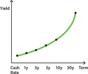
Source: RBA
Next, the outright level that the yield curve starts from matters as well, where the yield curve could have the same shape in different years but the starting point differs.
Chart 2: Different Outright Levels of Yield
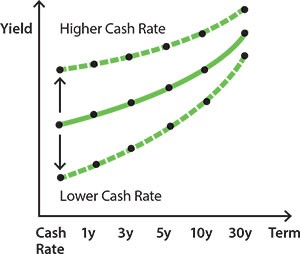
Source: RBA
And furthermore, the shape of the yield curve matters as well and is the reason I’m writing this note today, as a flat or inverted yield curve can say a lot about economic circumstance.
Chart 3: Varying Shapes of the Yield Curve
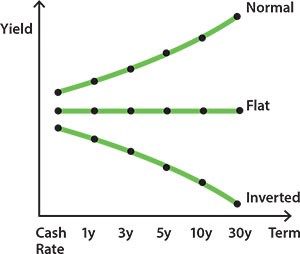
Source: RBA
For example, a flat yield curve could depict a benign economic growth environment with low inflation expectations.
Whereas an inverted yield curve can suggest a negative economic growth outlook (such as recession), or that central bank policy is becoming too restrictive and rate cuts need to be enacted.
An inverted yield curve can also highlight a varying liquidity or term premium, where investors can prefer bonds of longer or shorter maturities, depending on their investment horizon; i.e. life insurance funds investing in 30-year government bonds as a better asset/liability match for their liability profile, which could see 30y government bond yields move below 20y government bonds.
Flattening US Yield Curve & Recession Risk
A key indicator of recession risk that the market utilises is a flattening yield curve, especially as it approaches inversion.
But how do we address the different points in the yield curve’s shape, what time horizon, what liquidity preference is present, what inflation impulse?
A common reference point for many is the differential between 2y and 10y government bonds, called “2s10” for short, where a low and decreasing differential or negative (inverted) differential could imply near-term recession risk in the coming 2 years, if the market is factoring in less or negative economic growth.
In the current economic environment, this flattening is happening already, as US 2s10 has dropped to +21bp (at time of writing).
In expanded form: US 2y bonds are trading at 2.17% and 10y at 2.38%, a fairly flat differential or “spread”.
Chart 4: US 2s10 Spread
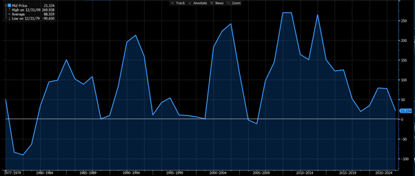
Source: Bloomberg, as at 23/March/2022
The Rigor of 2s10
An issue we have with relying on 2s10 as an indicator by itself, is that alone it lacks dynamism and has been shown through several academic studies to be unreliable relative to other more robust indicators.
One such study was conducted by the US Federal Reserve in 2019, where there was “No Single Best Predictor of Recessions” and that other indicators such as 1s10 or 3m10y were more reliable.
Chart 5: Comparing Different Yield Curve Spreads/Differentials for Recession Prediction
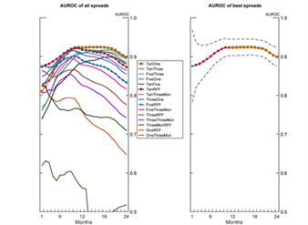
Source: US Federal Reserve
This also makes sense on a deeper level, where the differential between 3m and 10y interest rates (3m10y) is more relevant to current policy, whereas 2y10 might be diluted by incorrectly priced 2y interest rates (too high) or 10y interest rates (too low).
Rising Short Yields, Not Falling Long-term Yields
Going a step further, the current flattening of the US 2s10 spread is also led by a rising 2y bond yield, not by falling 10y yields.
This is important, as falling longer-tenor bond yields would indicate a lower outright level of expected economic growth, inflation and possibly term premium. This in turn could also highlight that short-term bond yields are too high, given the dramatic difference between the current US cash rate and 2y bond yields.
For example, compare the US sovereign yield curve today (green line) versus 3m ago (yellow line).
Chart 6: US Sovereign Yield Curve – green = current, yellow = 3m ago
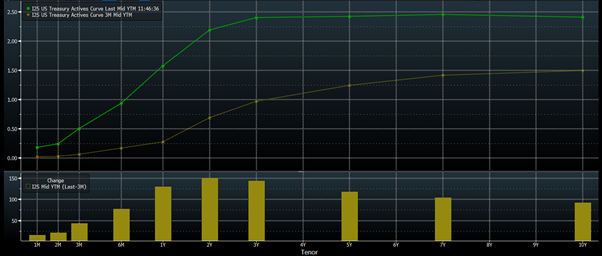
Source: Bloomberg, as at 23/March/2022
The 2s10 spread has flattened dramatically, as 2y yields have risen on rate hike expectations and the US cash rate is currently 0.25-0.5% (as a band).
The implication of this dramatic flattening is that maybe all the rate hikes expected over the coming 12-18 months won’t materialise.
We’re starting to see this notion priced into futures and OIS pricing, where there’s a slight inversion in US cash rate expectations.
Chart 7: US Eurodollar Futures Curve
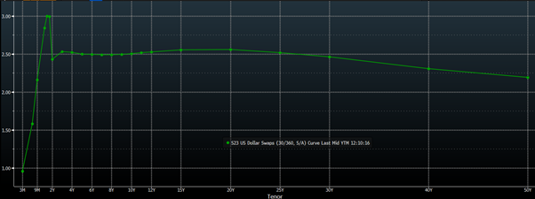
Source: Bloomberg, as at 23/March/2022
Is the market suggesting a likelihood of policy mistake and the Fed needing to cut rates after hiking too far (another possible indicator for recession)?
OR
Are 10-year yields (and longer) too low and need to be higher?
Personally, I’m in the latter camp, where the market seems unable to fully grasp the psychological loop that inflation expectations embed into wage-bargaining processes and cycles, and also the impact on long term yields from both quantitative tightening as well as the Fed stepping back from MBS purchases (QE), which will shift US mortgage rates higher.
As for other indicators such as 3m10y, 1y10y or 2y30y:
3m is currently at 0.51% and 10y at 2.38%, a very healthy differential of +1.87%.
1y10y is at +0.81% and 2y30y is +0.48%.
Does Inversion REALLY Predict and Predate Recession?
Another dynamic I wish to highlight is that not every time the US yield curve flattens is due to the Fed overtightening.
Several times over the past 80 years, the US yield curve has flattened due to non-monetary policy reasons, where recession occurred due to other variables.
Since WWII:
| US Recessions (Year Started) | Cause |
| 1945 | Exogenous shock – end of war, saw government spending drop, technical recession |
| 1948 | Over tightening |
| 1953 | Exogenous shock – Korean War |
| 1958 | Pandemic |
| 1960 | Over tightening |
| 1969 | Over tightening |
| 1973 | Exogenous shock – Oil crisis, oil prices rose 400% |
| 1980 | Over tightening |
| 1981 | Over tightening (double dip from 1980) |
| 1990 | Overly loose policy forming malinvestment bubble + oil shock |
| 2001 | Overly loose policy forming malinvestment bubble |
| 2007 | Overly loose policy forming malinvestment bubble |
| 2020 | Pandemic |
| 2023? | Likely the pandemic + overly loose policy forming malinvestment bubble, rather than overly tight policy |
Source: Ironside Macro, US Bureau of Economic Research, St Louis Federal Reserve Branch, NBER Research
And in some of these cases, the yield curve only inverted during the recession, not before the recession.
Thus, it becomes more a correlation than causation story!
Closing Remarks
Writing this note during a volatile period for bonds, I couldn’t help but realise there’s a lot of chance, given the volatility and competing macro and geopolitical forces, that this view could become dated and obsolete quite quickly, depending on what happens in the coming weeks and months.
However, the flattening of 2s10 has been a regular conversation of the past month, and it worries me when we focus too much on one indicator alone, and especially one where the nuance is that other indicators can be more reliable and better reflect the current economic circumstance – such as 3m10y.
This isn’t to say a recession mightn’t be on the horizon for H2 2023 or CY2024, in which case the 2s10 would capture that risk most reliably.
As it stands, current US central bank monetary and fiscal policy is expansionary, near the all-time most expansionary levels seen during the pandemic, where the flattening of yield curves is due to central bank cash rate forecasts and rhetoric, rather than an actually higher cash rate.
This gives the US FOMC wiggle room.
The wiggle room allows the chance the Fed reacts to recession indicators and doesn’t hike as much as currently forecast, steepening the yield curve through a front-end rally. Also, more balance sheet reduction (QT) rather than hikes could also steepen the yield curve by a longer-end sell-off.
The views expressed in this article are the views of the stated author as at the date published and are subject to change based on markets and other conditions. Past performance is not a reliable indicator of future performance. Mason Stevens is only providing general advice in providing this information. You should consider this information, along with all your other investments and strategies when assessing the appropriateness of the information to your individual circumstances. Mason Stevens and its associates and their respective directors and other staff each declare that they may hold interests in securities and/or earn fees or other benefits from transactions arising as a result of information contained in this article.
